The information, the story, is the most important part of your infographic. as we already explained in the introductory post, if you don’t have a clear objective, you probably won’t end up having a decent infographic. However, the organization and artwork are also important and should be taken seriously.
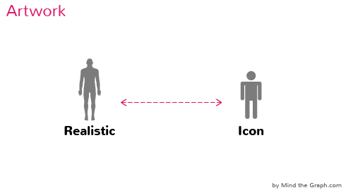
If you have the guts, this is when you start to scratch illustrations and define how you will “beautify” the infographic. The artistic style you choose, is the ultimate step in the visual presentation and heavily influences the reader’s perception about your work. You should aim for beauty and simplicity at the same time. Depending on the artwork style, you define it as more “realistic” or more “iconographic”(these are the two extremes, in terms of details).

We know that the regular scientist don’t have illustration skills and this is a major limitation in how you tell the story. The common approach to scientific figure design is: scan your preferred book or look for figures in Google Images, then start creating from what you got.
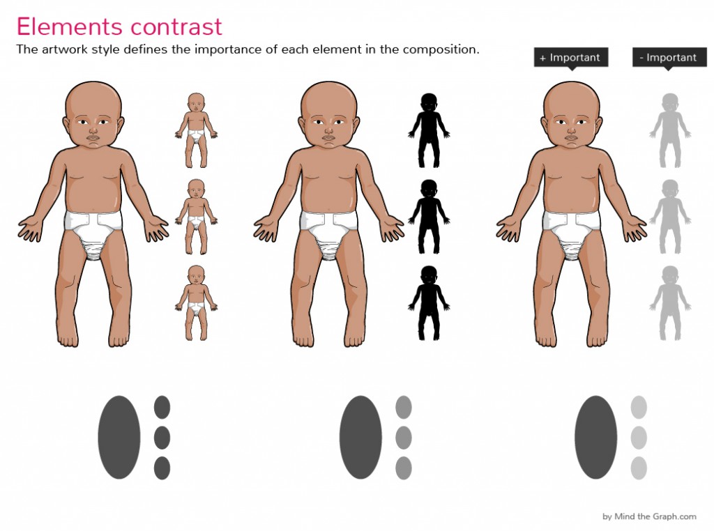
Depending on the relative “importance” of each element you’ll organize them differently when choosing the layout, as you already know. What we wanna exercise now is the ability of using different artworks to represent hierarchy in your infographic. Have a look in the example:
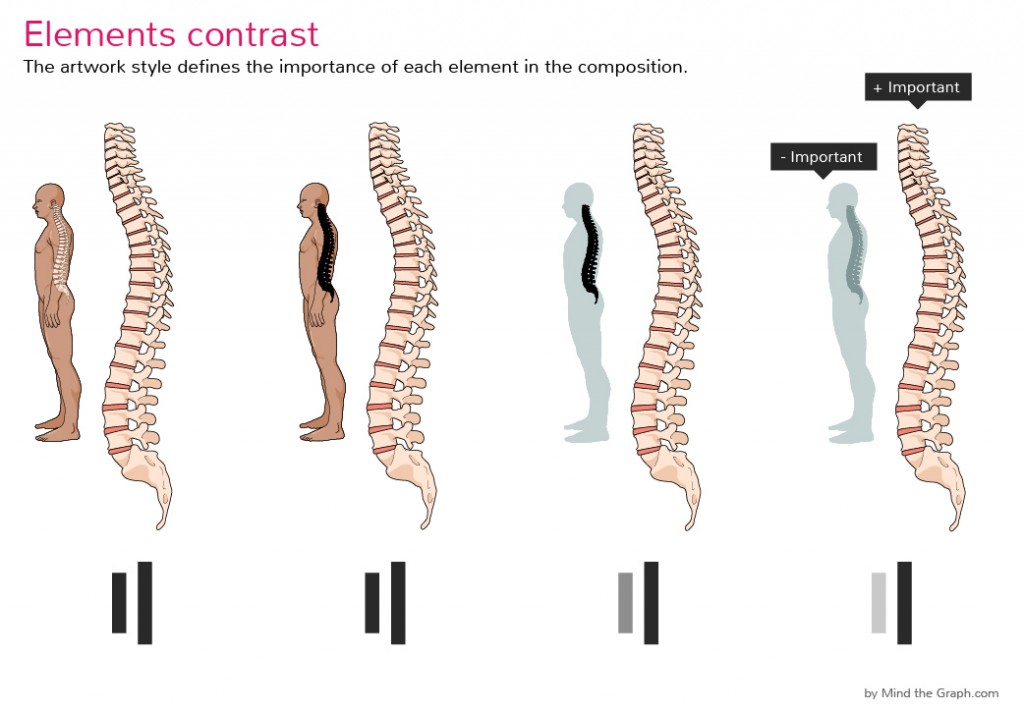
Another example. You see how the hierarchy between the elements is revealed simply by changing the artwork style. Bottom line is: you don’t need to always use the most realistic style! Remember that: unify, simplify, beautify. That’s our moto.
However, what we propose is the opposite: have a good story crafted and Mind the Graph helps you find the illustrations you need and choose the appropriate artwork style. You find literally thousands of illustration in 5 different artwork styles. The most important thing is having in mind what images better represent and support the story you wanna tell.
Feel ready? Click here to start creating stunning scientific infographics with Mind the Graph.

Subscribe to our newsletter
Exclusive high quality content about effective visual
communication in science.


