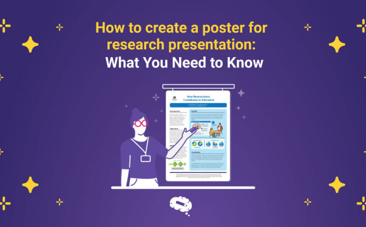
A poster for research presentation serves two purposes: as a tool for connecting with others and a means of communicating one’s research.
When you give a poster presentation at a seminar or conference, you are providing information to your audience about the research you performed.
There is more than one way to design and display your project on a poster, just as there are many ways to present a slide show verbally. A few guidelines and factors are really important.
Many, however, do not produce a visually appealing conference poster so their chances of capturing attention and networking are slim.
But don’t worry! Here you’ll find all the info you’ll need for your poster presentation. So let’s start with the basics.
What is a Research Poster?
A poster for research presentation typically consists of a brief text along with charts, illustrations, images, or other presentation elements with the purpose of providing a summary of findings in an appealing manner to help disseminate information and spur discussions.
Your poster can be arranged either in portrait or landscape format, depending on its size.
The organizers of seminars or conferences usually equip presenters with a presentation board and clipboards, as well as other equipment for holding and projecting poster presentations.
While other participants are watching the posters for research presentation and getting involved with the poster exhibit, the researcher stands nearby and explains it.
How to do a research poster presentation?
A research poster presentation is often discussed, but also how to do it is important.
It turns out that your poster can be used in a variety of ways, depending on where and to whom you are presenting.
An overview of your research in five to ten minutes for people with no previous knowledge in your area. It is a two-three minute summary followed by a 10-minute question set that you present to someone with expertise in your field.
The key here is to skip everything they already are familiar with and put the emphasis on the new content.
There will also be people who will read your poster independently, either in case you are giving a presentation to someone else, you took a short break to see someone else’s post, or because they generally opt to check out your poster first.
Your poster should be suitable for all three categories of presentations. It also needs to have text large enough to be readable, as well as enough equations and tables so that you can present a discussion without reading the entire text.
Just don’t overdo it. Keep it simple and big. Please do not copy and paste from your paper. These paragraphs will usually involve a lot of text explaining. Visuals are essential for effective posters.
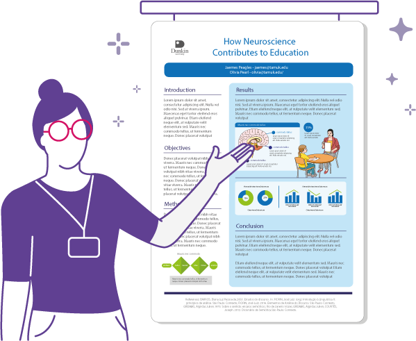
Remember that you should engage your audience in an energetic discussion during your presentation.
A one-on-one conversation is quite common, as is talking to a crowd. Especially when there are only a few people present, pay attention to them to determine when to explain more elaborately and whether to progress at a faster pace.
Show your gratitude for readers who come by to see your poster and engage with you.
What should a poster for research presentation contain?
It takes time and effort to condense an entire research project into a poster. A good starting point is to outline your poster first. This is usually what posters should include:
- It is crucial to include a title and list of authors. You need to have a title that grabs the reader’s attention, so they are inclined to read the poster.
- An institutional logo is commonly included on posters, often alongside the heading and authors’ names (for example, the logo of theresearch lab).
- You should include an introductory paragraph, outlining your research as well as descriptions of key terms.
- The methods and materials section contains a short explanation of the methods, techniques, and materials used to complete the project.
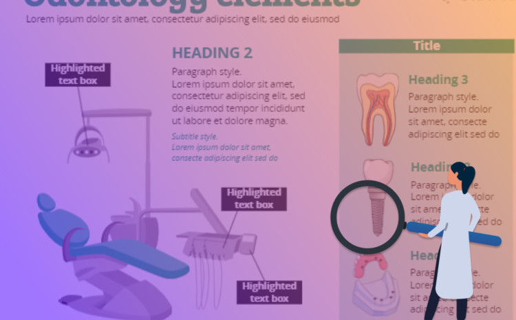
- In order to make the poster appealing to the reader, illustrations and tables are essential. Check out this free gallery of scientific illustrations.
- A section describing the results and conclusions of your work, clearly and concisely describing its significance and relevance to readers.
- A brief acknowledgement of your research supervisor, sources of funding, etc..
It is important to note that some things such as citations will not necessarily fit on a poster.
If so, then you should cite supporting evidence, which can be done in short parentheses or by summarizing or quoting.
You might consider providing a handout that combines citations and the abstract of your research.
What are the tools available to create my research poster?
There are many tools and software programs that you can use to create a research poster. When choosing a tool, consider financial accessibility, what you are more comfortable using and whether or not you are willing to learn a new program.
PowerPoint
Easily accessible and popular. The typical use of PowerPoint is to create standard-sized slides for presentations, but a slide’s dimensions can be changed in PowerPoint.
Changing its dimensions from 11 inches wide by 8 1/2 inches tall to 40 inches wide by 32 inches long will result in a bigger print. It is basically a poster-sized “slide”.
There are several features you can use in PowerPoint, including embedding text, adding graphics, and adjusting the background hue.
Photoshop, Illustrator, and InDesign
These are professional software with many features. However, they are more sophisticated and therefore more expensive and complex.
They are good for posters including many high-resolution images. There is however a relatively steep learning curve that can be challenging at times.
Poster Maker
This is an easy to learn, easy to use tool. It is integrated with a gallery of more than 40,000 scientifically accurate images and illustrations following the same design style to compose an attractive poster.
Poster Maker also automates the process of turning your research paper into a beautiful poster layout with artificial intelligence in just a few minutes, simply by submitting your paper, with no effort or any design skills required.
It is easier to remember a research study with remarkable and accurate illustrations and images.
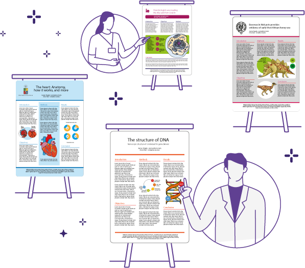
See some examples of posters built by the AI of Poster Maker:
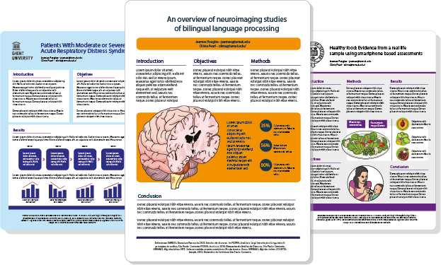
There are a variety of poster outlines that you can choose from in the tool, and there’s also a customized service to better suit your needs.
Now, you can also notice from the examples above how the posters are outlined containing all the essential components mentioned in this content in place:
- Title/logo of the university
- Background/ Introduction
- Questions/knowledge gap
- Methodology (limit it to the essentials)
- Illustrations/table/images
- Results/ data output
- Conclusions
- References and acknowledgements (smaller at the bottom)
So finally, when making your poster for research presentation, always double-check your work before submitting to print, so you get the best results possible.
Make sure all images and text are correct. Be sure to include all essential content in a logical order. Align the logos correctly and make sure they are visible. Make sure all graphics, illustrations, and charts are clear and readable.
Checking these points ensures that your poster is ready for the audience!
If you are on the process of writing your scientific paper, you might want to check this guide: “How to write an awesome scientific paper”

Subscribe to our newsletter
Exclusive high quality content about effective visual
communication in science.

