Present a scientific poster is a common way to communicate a scientific research. It is an important part of science congress, mainly for students to show their results. But in a ocean of data and information, it’s hard to stand out. How to reach the attention of the audience?
As a biologist who helps scientists to show their work in the best way, I see daily the major difficulties of researchers in presenting their work in an accurate, beautiful and thought provoking way.
Therefore, I’ve listed the main steps to take into account in the creation of a scientific poster.
⦁ You need to define what will be highlighted
When you try to highlight everything, nothing stands out. In a scientific poster, you have to keep in mind what information the reader will be able to see with a certain distance, to catch up the attention to a closer reading.
Those more interested readers who approach to read the post will absorb the full content. Set the priority and the flow to read.
What should be read at the first sight? Normally, title and illustrations.
⦁ Use an aesthetically pleasing and beautiful layout
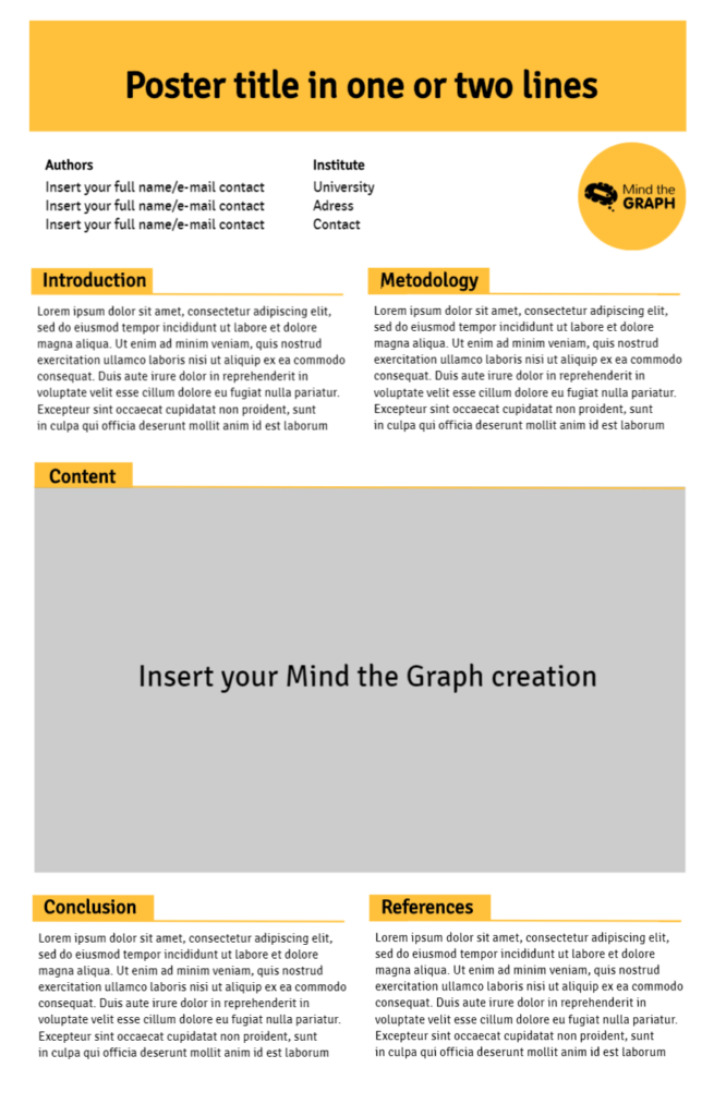
We are attracted visually to things that have a nice and beautiful aesthetic. The elements have to match each other, they can’t be just a lot of information put together. Search for templates and follow the suggestions on letter size, layout of elements, etc. Pay attention to the alignment, boards and spaces between the objects. This beatiful template was created in Mind the Graph and is available to our users:
⦁ The headline
Your title should be seen from afar. Often all we can see at the first glance on a banner is the title and illustrations (when they exist). It’s at this initial moment that the reader decides if the title is interesting enough for a closer look. Make sure your title is large enough to be read from a distance, and to raise some curiosity.
⦁ Illustrations
The illustrations are very important to draw the attention of the reader and make your poster more self-explanatory. A good illustration makes your work easier to understand. You can use illustrations to show your methodology, your object of study, compare results and more.
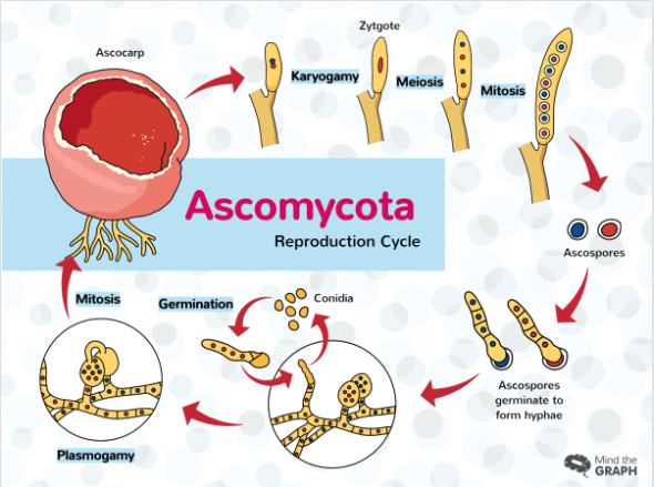
Beautiful and scientifically accurate illustrations are able to highlight a presentation. Science magazine did a little research and asked scientists living different moments in their academic life how they read scientific papers and the figures and graphical abstracts were almost the first reading. In a poster presentation, the illustrations also make a difference.
⦁ Text body
This is a part reserved for the most interested reader. The one who will actually stop to read and to ask questions about your work. It’s okay if the text isn’t fully readable from a distance. However, there is a limit of text to be used so that your poster does not turn into a visually grueling mess. Summarize and prioritize the information.
The poster should be self-explanatory, but probably some people will want more details. In this case, they can talk to you and ask or get your contact email on your poster and ask for more details.
See what font size is indicated in the banner template you are using, and do not diminish the font infinitely until you fit everything you want to write. Your work should be embedded in the poster and not the other way around
Do you want to create a beautiful scientific poster for a conference? Use a Mind the Graph Template!

Subscribe to our newsletter
Exclusive high quality content about effective visual
communication in science.


