Working on your next big microbiology poster? Wondering how not to make it look like just-another-microbiology-poster?
If you said yes to both these questions, then this extensive guide on how to create stunning and jaw-dropping microbiology posters is just for you.
But, why should your poster look extraordinary and stunning? Well, whether you are a:
- student looking to score better grades and woo your professor with a stunning poster,
- researcher looking to spread your research and make an impact on your audience,
- startup owner wanting to attract more clients,
- or anyone who wants to make a concrete statement,
then, you need an extraordinary, stunning microbiology poster in your life.
We all know the kind of impact that visual content can have on us. Here are some solid statistics that are proof of this fact:
- A whopping 90% of the information processed by our brain is visual!!
- Our brain processes visual information 60,000 times faster than text-based information.
Researchers have time and again stressed the importance of visual representation of information.
And, the same applies to your work on microbiology too.
If you want to create a lasting impact on your audience and get closer to your career goals, then what better way than a good old microbiology poster?
But, many people have been creating posters on microbiology for years. What difference are you going to make? That’s what this guide is all about.
We are going to look at some techniques and hacks with which your microbiology poster is bound to stand out amongst hundreds of other posters.
By now, you must be curious about these tips, so let’s start diving deep into them one-by-one.
The Layout is Everything
Yes, you read that right. The layout is everything. It is extremely important to begin your poster with a layout.
Of course, you would have a rough idea of what you want on your microbiology poster.
You would have it on your mind. But, you must get it down on something concrete, something visible.
Only then will you have a fair idea of how your poster is going to look like.
Starting with a layout is the basic ingredient of an extraordinary poster. Hence, do not skip this step, or things may go wrong.
But how do you start with your layout? Just grab a pen and paper. Begin playing around with the basic layout.
First of all, decide what message you want to convey and what information you want to add.
Try to spend time here so that you do not miss out on any important information that you would want to add to your poster.
Next, visualize your imagination and get it all down on paper. You might be surprised to know that you would need several iterations of these.
You might not like the first one, or you might not even like the fifth one. The point is to keep drawing until you are satisfied with the layout.
Click Here to try Mind the Graph’s Poster Maker that helps you create science poster in 5 simples steps
Next, it’s time to get your design ready.
You can give your layout to a designer who would get the design ready for you.
But, the problem with this is that designers are expensive and will take their sweet time to get the design done.
At the end of it, you might want to make changes to your poster design. You don’t wanna go back to your designer for every little change.
So, what is the other option, then?
Make the design yourself! Yes, you don’t need a designer for that. You can use a scientific graph maker tool such as Mind the Graph, which will help you design your microbiology poster from scratch. But why do you need such a tool?
- You do not need extraordinary ninja tech skills to use this artistic graph maker. Even a novice can design stunning posters from scratch. It is extremely easy and intuitive to use.
- If you don’t want to design your poster from scratch, you have another option as well. Use one of the readymade poster designs provided by the tool just for the scientific message you want to convey.
- You don’t have to do much hard work. You can easily get done with your poster design in a surprisingly shorter time.
- You can play around with the poster design as and when you want, which I feel is the best part. You don’t have to wait for your designer for every little edit you want to make. You can make the edits within minutes.
Creating such a design for your microbiology poster will ensure that your final outcome is elegant and professional, which are some of the secret ingredients to making an extraordinary poster.
Such a professional, elegant design is what will make you stand out from the other medical creatives, which are just a bunch of images arranged on the poster.
You don’t want your poster to look random. You want to make it put together. This will get your audiences’ eyes instantly.
If you still feel that making the design yourself is difficult, then hear this out. This is a one-time thing.
Once you make a stunning poster design, half your job is done. Trust me! You’ll be in awe of your owe microbiology poster design.
Next, all you have to do is deliver the right message that your audience is expecting and align with your goals for this poster.
Here is an example of a stunning microbiology poster that you can create using Mind The Graph:
Highlight your Offer
All the great posters out there always have a great offer. They predominantly tell your audience what they will get after reading your poster.
Adding an offer is important because it will urge the audience to take some action that will benefit you.
This offer will also make them remember and talk about your microbiology poster even after they are done seeing your poster.
Hence, you need to highlight your offer and make it as creative as possible. You should make it readable and comprehensible to your audience.
You should tell precisely and exactly what they will get after reading your poster.
Click Here to try Mind the Graph’s Poster Maker that helps you create science poster in 5 simples steps
This will be your main call to action. Here, you can make some bold claims so that it leaves your audience impressed.
You can woo them with some solid statistics to back your claim.
You can also urge your audience to take some action after reading your microbiology poster.
Whatever you say or claim should be enticing and curiosity-driving to them.
Only then will your poster’s impact will last even after your audience move on with their lives.
You can also add an offer that contributes to the greater good and helps progress the microbiologists’ community as a whole.
Combining an artistic graph with a great offer is the winning formula to an extraordinary microbiology poster.
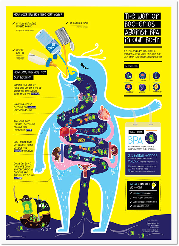
Here is a great example of a microbiology poster where there is a section called “What can you do then.”
This is a great way to make your microbiology poster 10x more interesting.
Never Ever Underestimate the Power of Minimalism
Now that we know that elegance and a great design is what can make your microbiology poster stand out, this doesn’t mean that you should simply fill up your poster with random things. Too much clutter is never good for your poster.
Minimalism is the way to go for a winning microbiology poster design. Instead of adding too many irrelevant things to your poster, stick to a theme, and ensure that your poster design is cohesive.
You can use icons in your poster as these look minimalistic yet support your point well.
You can also make your poster much more interesting by using a cartoon character.
This cartoon character can explain things to the audience, and thus, your poster will look super-interesting.
You can also use an infographic as a poster. According to Wikipedia, “Infographics can improve cognition by utilizing graphics to enhance the human visual system’s ability to see patterns and trends.”
This means there is no doubt in the fact that infographics when used as posters, can help you sound way more authoritative and creative.
Infographics will prove that you have put in a lot of effort to convey your message effectively.
Moreover, another awesome thing about using an infographic as a poster is that it is a multipurpose content asset.
This means that you can share your infographic on various platforms to promote your microbiology poster better.
You can use channels such as your website or social media to promote your infographic poster.
You can also use guest posting to publish your poster on various microbiology websites.
This is a great way to increase the visibility of your microbiology poster. This way, your poster may even go viral overnight.
Hence, this is a great hack for you to try!
For instance, here’s an example of an infographic that can be used as a poster:
Click Here to try Mind the Graph’s Poster Maker that helps you create science poster in 5 simples steps
Follow a Usual Outline
When it comes to posters, it is good to stick to the usual, tried-and-tested outline.
Following a predefined outline will help you make your microbiology poster more cohesive and help your audience understand your point better.
Here’s an outline structure you can follow:
Headline
Your headline is the first thing that your audience will go through in your microbiology poster. Hence, it is crucial to start your poster right.
Use a headline that captures the idea of your poster in a precise way. You should also try to make your headline enticing and curiosity-driven.
Main Body
Next comes the main body of your poster. Here’s what you should include in the body of your poster:
- Introduction
- Methods
- Solutions
- Figures and tables
- Conclusion
- Proof/results
- Call to action (CTA)
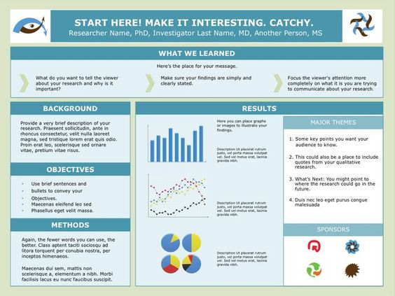
You can start with a premade template instead of starting from scratch. This will help you save time and make your job easier.
These can help you design your microbiology poster the way you want without having to spend much time on the design and layout.
Or, you can also share any premade scientific poster template with your designer so that they can use the template to design your poster as per your requirements.
Here are a few templates that you can use for your microbiology poster:
Have a Reality Check
Lastly, it’s time to have a reality check. Did your microbiology poster really turn out good?
It is important to assess and evaluate your poster’s quality before actually presenting it to your audience. But how do you do this?
Start with asking yourself these two questions:
- Does the important message that you intend to convey with the help of your poster stand out? Is it clear enough for your audience to understand? If it is vague and not easy to catch hold of, then you need to redesign your poster to ensure that the message stands out.
- Would you put this poster up on hoardings? Is it good enough to have that kind of an impact on people, especially microbiologists?
Next, you can share your poster with two types of people:
- Microbiologists or people who have knowledge on the subject – Check to see if they understand the gist of your poster and find value in it.
- Regular people who do not know about microbiology – See if they understand the point you are trying to convey through the poster.
Ensure that everyone is blown away by your microbiology poster.
Ensure that your poster is jaw-dropping and people actually find value after going through your poster.
Also, ensure that your offer or call to action stands out and people can understand it. If not, then reevaluate your poster design.
Change its layout, the main messaging, or you can even play around with the visual elements.
This step will ensure that your poster is truly extraordinary and is going to be talked about for a long time by your audience.
Conclusion
There you have it, the secret tips and hacks to create a truly stunning microbiology poster that will leave your audience in awe. If you diligently follow these techniques and ensure that your main point is conveyed, your poster is going to win the hearts of many.

Subscribe to our newsletter
Exclusive high quality content about effective visual
communication in science.


